Table of Contents
Interface : Forms
Every form in the FDM online has the same repeating design. It is made for your convenience.
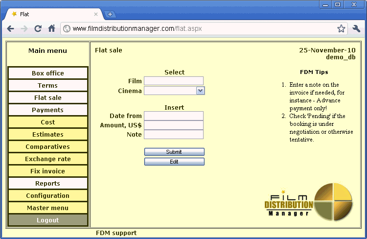
Let's consider details on an example of the form Flat:
Form layout
Left part of the form – is the main menu. Most used items have white color, less used – yellow color. And last inverted link is logoff operation that force the logoff from the FDM online.
Center part of the form – is the form area.
In the left top corner you can see the name of the current form (“Flat Sale”).
In the right top corner – current date (shows USA server time), and the database name. Database name – very useful for someone who have several logins and working with them simultaneously.
Left bottom corner contain the email of FDM support.
In some forms on the right side you can see short tips about what data needed to be changed / entered on the form.
And the right bottom corner contains the logo of FDM online.
Buttons
Usually every form always contains the button “Submit”. It do saving of data that was entered / edited, or do the report processing if their report form.
Ok, we can talking about “submit” is the universal button.
If the purpose of form is to insert any data into the database – usually it contains “Edit” button. This “Edit” button is the link into editing form for data that be entered in this form.
In FDM online edit forms have no direct navigation from menu, but from the parent forms only.
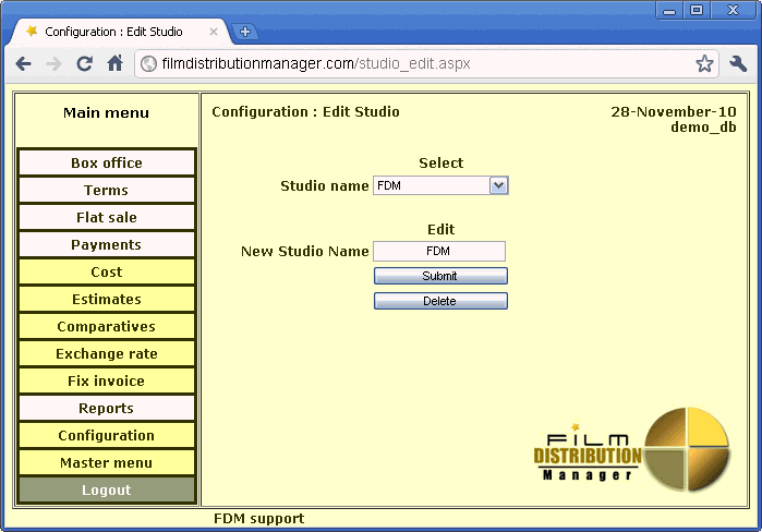
Ok. If this is an Editing form, like on this screenshot:
In this case, the “Edit” button is changed by “Delete” button. “Delete” button erase the current data record.


